CustomRenderers
From autoplot.org
Purpose: Describe how custom renderers are created in Jython.
Audience: Developers and Scientists comfortable with Jython code.
Contents |
1. Introduction
Autoplot tries to provide a simple plotting tool for common applications, such as a stack of line and spectrogram plots, and also more specific applications such as orbit plots and histograms.
To solve a problem for everyone is always more expensive than trying to solve a particular problem. Jython scripts have been effective at allowing strange file types to be read, and to support a specific science workflow.
Translating data into pixels is the task of the PlotElements, and more specifically the Renderer object of the Das2 library. Autoplot v2017a_6 makes this easier to do, by allowing custom Jython code to compose Renderers. This reduces the impact on Autoplot when rarely used Renderers clutter the application. For example, a rendering mode called the "PitchAngleDistribution" mode has always existed so that we could look at this form of data. This is finally being generalized into the Polar mode and will be hidden, but this rarely used mode could now be implemented in Jython, keeping the rest of the application clean.
Also, sometimes a quick annotation needs to be added to a plot, and this can serve that purpose as well. Note the DasCanvas has had methods for tying in Jython code in its "addTopDecorator" and "addBottomDecorator" methods. (A decorator is a computer science term, where an object exists to add a little functionality to another.)
This also provides a route for Renderers to be created externally, where one of Autoplot's users can write a renderer, prove its usefulness, and better argue that it should be part of the application itself.
2. Adding Custom Renderers
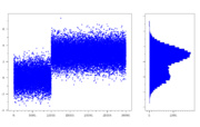
Here's a Jython script defining a vertical histogram:
from org.das2.graph import Renderer
from java.awt.geom import GeneralPath

class HistogramRenderer( Renderer ):
   def autorange( self, ds ):
       xr= extent( ds )
       yr= extent( ds.property( QDataSet.DEPEND_0 ) )
       bds= join(rescaleRange(xr,-0.1,1.1),rescaleRange(yr,-0.1,1.1))
       return bds

   def render( self, g, xaxis, yaxis, monitor=None ):
       xzero= xaxis.transform(0,xaxis.getUnits())
       ds= self.getDataSet()
       if ( ds==None ): return
       yds= ds.property(QDataSet.DEPEND_0)
       ddy= float( ( yds[1]-yds[0] ) / 2 )
       cc= self.getColorControl('color',Color.BLUE)
       cb= cc.darker()
       gp= GeneralPath()
       yd= yaxis.transform(yds[0]-ddy,yaxis.getUnits())
       gp.moveTo( xzero, yd )
       for i in range(ds.length()):
           y= yds.value(i)
           x= ds.value(i)
           xd= xaxis.transform(x,xaxis.getUnits())
           yd= yaxis.transform(y,yaxis.getUnits())
           yd0= yaxis.transform(y-ddy,yaxis.getUnits())
           yd1= yaxis.transform(y+ddy,yaxis.getUnits())
           gp.lineTo( xd, yd0 )
           gp.lineTo( xd, yd1 )
       gp.lineTo( xzero, yd1 )
       g.setColor( cc )
       g.fill( gp )
       g.setColor( cb )
       g.draw( gp )

# demo code below shows its use.
reset()
ds= append( randomn(5334,10000) , 3+randomn(5335,20000) )
setCanvasSize(724,460)
plot( ds, xpos='3em,70%-3em', ypos='50px,400px', color=Color.BLUE, renderType='scatter', symbolSize=3 )

plot( 1, histogram(ds,50), xpos='70%+2em,100%-2em',  ypos='50px,400px', color=Color.BLUE,
      ydrawTickLabels=False, renderer= HistogramRenderer() )
See https://github.com/autoplot/dev/blob/master/demos/20190523/demoCustomRenderer.jy
2.1. Note
- the plot command has a new "renderer" (not "render") switch. Each plot must have its own instance, two plots cannot share an instance.
- the renderAPI includes a Monitor reference, but this is not used, and Renderers should get this job done quickly (<300ms).
- the dataset must be retrieved with the self.getDataSet method.
- self.getColorControl('color',Color.BLUE) gets the color from the plotElement's "rendererControl" property, providing a way to control it.
- the example here is a little sloppy with Units, assuming the Axis units and data units are the same, and should be updated.
- the autorange method provides Autoplot with a way to "discover" the data with this rendering mode. It is optional, but helps to describe what the renderer is intended to do.
2.2. Work to be done
- icons will be generated automatically, by way of the render method.
- autoranging multiple Renderers fails.

